Presentation - great way concisely and clearly communicate information. We strive to make it beautiful and unforgettable, informative and impressive. However, template slides, popular stock pictures and charts are already pretty boring for everyone. Using outdated techniques and graphics, you will no longer be able to produce an effect on the viewer. Below, we'll look at some fresh ideas that will help convey your information in an interesting and understandable way for everyone.
1. "People" (or about infographics)
Almost all people perceive dry statistics badly. After all, the numbers themselves do not tell us anything. Therefore, it is very important to present information in such a way that it is perceived on an intuitive level, and the viewer would not have to make a lot of effort to understand and realize it. Infographics come to the rescue - i.e. a way of presenting numerical or statistical information in a graphical form.
Let's say we want to talk about the fact that only 20% of people with a valid driver's license own a car. Of course, you can write about it in text or make a pie chart, as in this example:
Or you can present the information more clearly. 20% is 1/5th, that is, 2 people out of 10 or 4 people out of 20. Let's take advantage of this and make a slide in which everything will be obvious:

By adding figures of people and cars, we turned the statistics into an interesting image that not only attracts attention, but also helps to present to the viewer how much it is - twenty percent. While the usual diagram does not have such properties, and generally resembles "pac-man" 🙂
2. Big numbers
Another way to effectively present digital information is to make the numbers huge. Literally! Let's compare two slides:


The location of the information on the first slide allows us to insert a photo of a cute dog, but on the other hand, this dog takes attention away from the content. The second slide makes you think about the numbers. Here we must build on the task of the narrator: if the goal is to evoke an emotional reaction, then we use the first slide, if we focus on facts, the second.
3. Dark background
Typically, presentations use a light, calm background. Most often this is justified, but do not be afraid of a dark background. It can be stylish and beautiful! For presentations of watches, jewelry, luxury brands, tech and more, a dark background is perfect. It is not necessary to use black, there are a whole lot of beautiful dark shades.


4. Weighing
When we need to compare two products, evaluate the pros and cons, show the pros and cons, we make lists. And sometimes such reasoning needs to be displayed right on the slides. The question arises: how to make these studies visual for the viewer and at the same time push him to make the “right” decision? In this case, you can use a little trick and depict scales on the slide. You can use stylized scales, Themis scales, market scales - everything that allows the imagination and style of a particular presentation. In PowerPoint, it's nice to use the Balance SmartArt object.
Do you need an iPhone? Let's take a look at the slides:


Both slides have the same arguments, but in the first case we don't get the impression that we should buy an iPhone. But the second example with weights clearly inclines us to buy =)
5. Cards
We show any geographical data on maps! If we work with clients from other countries, cities, regions, we boldly place a map on the slide and mark these locations with color. Within one city, you can draw a metro map with the designation of stations where our points of sale are located. Even the most beautiful bulleted list will not give the effect that a regular map does. And, of course, if we make a map showing how to get to our office schematically, customers will be very grateful.
For example, consider two slides:


On the first slide, there is simply a list of airfields, on the second - the same airfields, but with reference to the map. Obviously, in terms of perception, the second slide is much more convenient.
6. Drawing
When was the last time you held a pencil in your hands? What for? you rightly ask. After all, everything is much more convenient and faster on a computer. However, using hand-drawn objects in a presentation can have an unexpected and very powerful effect! Such a move will be useful for designers, wedding and holiday decorators, furniture manufacturers, and many others.
Suppose we have a furniture store and we want to sell a sofa. How to show the client that our sofa is exactly what he was looking for? Of course, it is necessary to list all its advantages and specifications but buying is an emotional act. First of all, we need to make a person want to have this sofa at home. Many companies already use the method when the client can upload a photo of his interior and insert products from the store there, choosing the right ones. Unfortunately, this will not work in the presentation. But sometimes abstract interior items drawn with a regular white marker will advertise the store better than any photos:

In the above example, we filled the interior of a potential client with simple items that everyone has and, of course, placed our sofa in the center of the composition. “Flat” details complete the picture of the interior, give it a feeling of comfort, but at the same time do not distract attention from the main thing. The advantage of abstract images is that they leave a lot of room for fantasy and imagination. After all, each person represents his own interior.
Of course, it is not necessary to literally draw with a marker on a printed picture (although this is quite acceptable, it is just not convenient for everyone). Any graphics editor allows you to achieve a similar effect.
7. Flowcharts
When it becomes necessary to describe a process in a presentation, lists are often used. In rare cases, pictures are added to them. But a list of 5 or more items is already perceived by the viewer badly. What if there are more? Take the time to create a beautiful and visual flowchart that explains in detail the essence of the process. It will significantly save customers time and reduce the number of questions.
Thus, it is possible to schematically depict the work of a workshop or department, the principle of operation of a device, the process of interaction between departments, or, as in our case, the process of ordering a presentation at the Mikhail Tsarev Studio:

Be creative, look for new ideas and don't be afraid to surprise!
P.S. All data and statistics used in the examples are fictitious, and any coincidences are random 😉
Perhaps one of the most requested methods for bearers to be able to insert cards from Google Maps in PowerPoint. A quick web search might give you workarounds on how to take screenshots and embed them in your slides, but we have something much better. is an add-in for office applications such as PowerPoint, Word and Excel that allows you to generate and insert maps directly to your files via Google Maps.
Install Maps for Office from the Apps Store
To get this add-on, go to App Store via tab Insert and search Maps for Office.
You will notice that the add-on has a price tag of around $3.5. Alternatively, you can install the app on an experimental basis. Once installed, you will be able to find and insert maps through Google Maps into PowerPoint slides, Word documents, and spreadsheets made in Excel.

Map Generation via Google Maps for Office Documents
The good thing about this add-in is that it allows you to generate maps from a specific location using an address or longitude/latitude.  You can also get to select map types such as hybrid, terrain, satellite and road maps. The add-on uses the Google Maps API which gives you perfect Google Maps integration in your Office applications. The add-on uses common APIs, however, you can also use your own API to use with the add-on.
For more detailed information see the add-in download page below. This add-in works with the following Office applications:
- PowerPoint 2013 or later
- Word 2013 or later
- Excel 2013 or later
- Excel Internet
Go to Office cards

Alternative Method to Insert Custom Cards in PowerPoint
While maps through Google Maps may seem like a good choice, sometimes you may just want a map for a continent, country, region, or world map to design for your topic. In such a case, you might be better off using editable PowerPoint Maps. slidemodel is a subscription based provider of PowerPoint templates that offers one of the most editable cards you can ever find.

These maps can be edited down to the specific provinces of a country, and if you're using a continent map, you can even extract countries separately from the main map. You can also recolor sub-maps and drag to extract parts of the main map. In addition, these templates come with GPS marker graphics that you can use to highlight specific areas. All card templates are very good quality and are ideal for professional presentations.

Purpose of work: To learn how to create a multi-level interactive map using PowerPoint.
Exercise:
1. Master the basic functions of PowerPoint.
2. Learn how to insert the components needed to create an interactive map in PowerPoint.
4. Be able to create "return buttons".
Work order:
1. Open the PowerPoint program in the Microsoft Office folder by clicking: Start - Programs - Microsoft office - PowerPoint . The main program window will open. 2. Click: File - New - New Presentation . 3. In the windowLayout Contents chooseBlank slide. 4. Insert the main map of the project into the program, for which do:Insert - Picture - From File and specifying the address of the map, download it (Fig. 1). 5. In the main menu, perform the following algorithm: slide show – slide change . In the window that opens, find the mode P rectangle outside . With it, the effect of changing cards is the most rational. Then uncheck the modes On Click and Automatically . Mark Apply to all slides.
Fig.1 Main window of the program PowerPoint.
6. To ensure the interactivity of the map, you should select the objects that will be linked by hyperlinks to the attached slides. The execution algorithm is as follows: Insert - Picture - Auto Shapes. In the windowAutoShapes choose:Basic Shapes - Polyline . With the help of the cross-shaped cursor that appears, we outline the boundaries of the object on the map. Be sure to close the line to get the whole object. 7. To remove the fill and make the selected area invisible, place the cursor on the object and right-click. In the window that opens, select AutoShape format. In the window that opens (Fig. 2), set Fill transparency 100%. Then do: Line Color - Other Colors (fig.3) – Line transparency 100% - Approx.

 Rice. 2. Program window. Rice. 3. Program window Colors
.
AutoShape Format
Rice. 2. Program window. Rice. 3. Program window Colors
.
AutoShape Format
8. Click: Insert - Create Slide . 9. In the windowLayout Contents chooseEmpty slide . 10. Insert a drawing (map, photo, table, graph, etc.) into the opened slide, which will be a hyperlink. For this inrun the following algorithm: Insert - Picture - From File and enter the file address. 11. Return to the main map, for which click the left mouse button in the windowStructure on the first slide. 12. C using a hyperlink, you should link the selected objects of the main map with the attached slides. To do this, place the mouse cursor on one of the selected objects and right-click. In the window that opens, select Hyperlink . 13. In the window that appears Adding a hyperlink (fig.4) choose Link to a location in the document . Select a location in the document slide 2 (or other associated with this object) . Similarly, hyperlinks are created with other objects. In attached slides, you can also highlight objects and set hyperlinks to other slides, etc.
 Fig.4. Program window Adding a hyperlink.
14. For the normal functioning of the interactive map, back buttons should be placed on the attached slides, providing a transition to the main map. The algorithm is as follows: in the window Structure click the left mouse button on the image of the second slide, and then successively click Slide Show - Action Buttons - Action Button: Back .Use the cursor to select a place on the slide for the back button. A window will appear Setting up an action (Fig.5). Install in the window By mouse click the following settings: Follow the hyperlink – The first slide is OK. 15. To test the functioning of the interactive map, press: Slideshow - Start showing. We carry out a check.
 Rice. 5. Program window Setting up an action
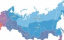
Preparing interactive maps is now very popular. There are great opportunities to use ready-made interactive maps online from the Internet, but in the lesson we can be let down by speed. In addition, we can prepare our interactive maps based on those learning objectives that we set before us. The proposed demo version of the map can be easily used for interactive whiteboard with proper setup. So, let's start creating an interactive map. Step one. Insert the main card. In this case, a map of Russia. Astvatsaturov G.O., Armavir more
Attention! For an interactive map, it is more expedient to set up not an object, but a whole slide. Step two. In the change of slides we find the "rectangle out" mode. With it, the effect of changing cards is the most rational. In the "change slides" we also remove the checkmarks from the "on click" and "automatic" modes. Step three. Now we need to create hyperlinks. They will be selected objects - a particular region, even a locality. In our particular case, we will single out the Krasnodar Territory and Karelia. We select them with a polyline. We get objects that will later become hyperlinks. Note! A solid fill is required so that the hyperlink appears not only along the path, but throughout the entire object. Set the format of the resulting image to 100% transparency. Further

Step four. On separate slides we place the maps of regions we need. Let me remind you that the change of all slides in the "rectangle out" mode. Step five. We make each of the selected objects hyperlinks to the corresponding maps. The recommended action of a hyperlink is "on hover". In this mode, the operation of the interactive map is most effective. If necessary, we can continue to deepen the content, that is, move from the map of the region to the map of the city ( locality). From here - to individual objects. Step six. Do not forget to place "back buttons" on all maps and on main map, and on a map, for example, a region. So what do we get? Further


Astvatsaturov G.O., Armavir The preparation of interactive maps is now very popular. There are great opportunities to use ready-made interactive maps online from the Internet, but in the lesson we can be let down by speed. In addition, we can prepare our interactive maps based on the learning objectives that we set for ourselves. The proposed demo version of the map can easily be used for an interactive whiteboard with proper settings. So, let's start creating an interactive map. Step one. Insert the main card. In this case, a map of Russia. more Attention! For an interactive map, it is more expedient to set up not an object, but a whole slide. Step two. In the change of slides we find the "rectangle out" mode. With it, the effect of changing cards is the most rational. In the "change slides" we also remove the checkmarks from the "on click" and "automatic" modes. Step three. Now we need to create hyperlinks. They will be selected objects - a particular region, even a locality. In our particular case, we will single out the Krasnodar Territory and Karelia. We select them with a polyline. We get objects that will later become hyperlinks. Note! A solid fill is required so that the hyperlink appears not only along the path, but throughout the entire object. Set the format of the resulting image to 100% transparency. Step four. On separate slides we place the maps of regions we need. Let me remind you that the change of all slides in the "rectangle out" mode. Step five. We make each of the selected objects hyperlinks to the corresponding maps. The recommended action of a hyperlink is "on hover". In this mode, the operation of the interactive map is most effective. If necessary, we can continue to deepen the content, that is, move from the map of the region to the map of the city (settlement). From here - to individual objects. Step six. Do not forget to place “back buttons” on all maps both on the main map and on the map, further, for example, the region. So what do we get? We point to the necessary objects. In this case, to Karelia or the Krasnodar Territory. Remember to set the arrow mode to "visible" so that the transition to other slides is carried out quickly. A hyperlink to a locality is made by a transparent Pavlovskaya rectangle. In fact, it is not visible. In our case, this is Krasnodar. Point to the name of the city... Map of the Russian Federation A hyperlink to a settlement is made by a transparent rectangle. In fact, it is not visible. In our case, this is Petrozavodsk. Pointing at the name of the city... Map of the Russian Federation So, we have two "return buttons" of different levels: one - the Russian Federation, the other on the region Map of the Russian Federation Map of Karelia View of Krasnodar from space So, we have two "return buttons" of different levels: one - the Russian Federation, another for the region Map of the Russian Federation Map of the Krasnodar Territory Materials of the following sites were used in the development: http://www.south.ru/yug.htm http://vip.karelia.ru/viewtopic.php?t=37372&posto rder=asc&start=650& http://mapsshop.ru/product_117.html


For beginners: breeding a broiler at home Boiled water for broilers
Only lovers will survive
Features of advertising aimed at children
retouching old photos in photoshop retouching old photos
What is an NPO: decoding, definition of goals, types of activities Does a non-profit organization have the right